Hoskinson Health and Wellness Clnic

Hoskinson Health Clinic

Brief

DISCOVER USER/CLIENT PROBLEM

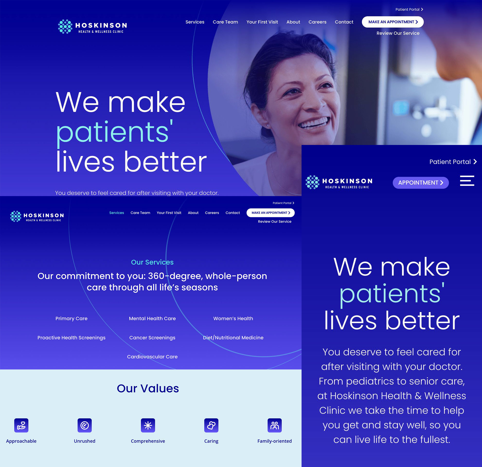
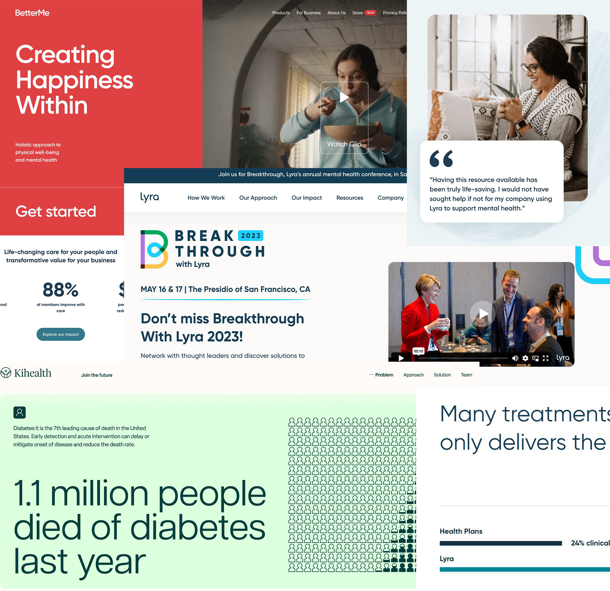
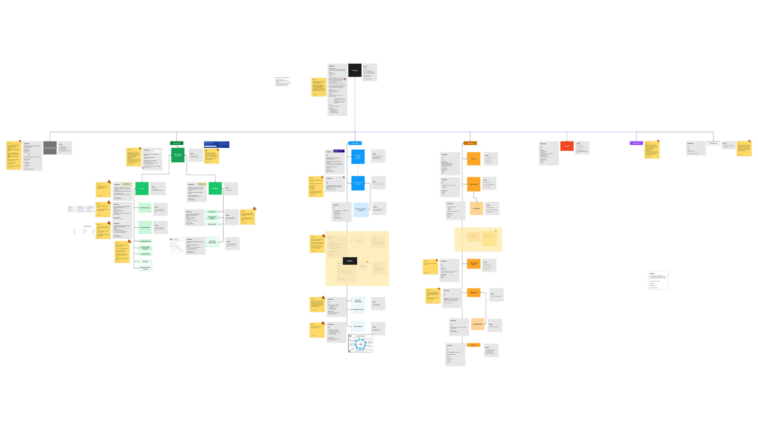
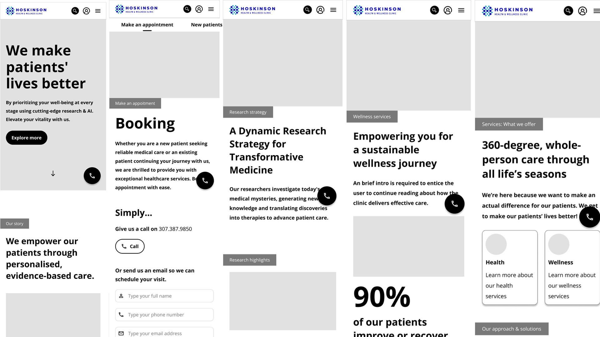
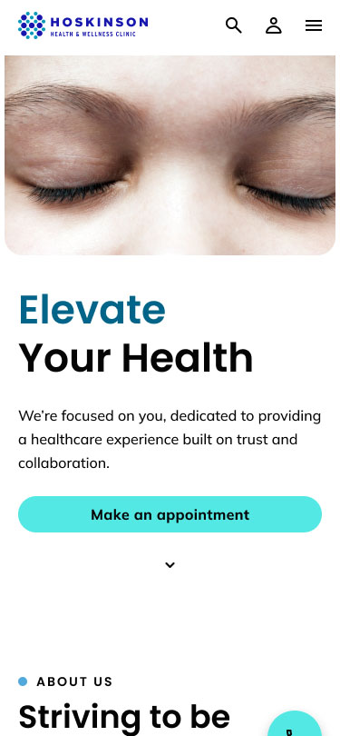
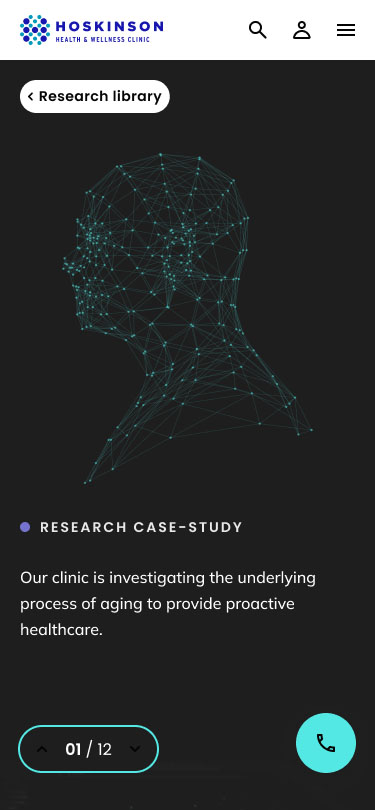
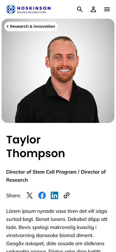
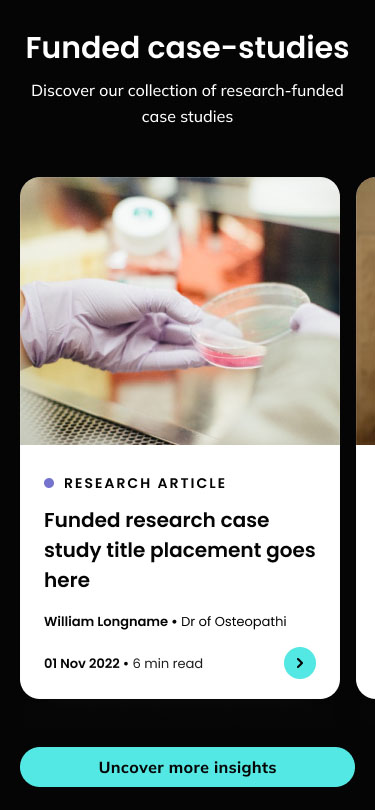
The brief for the Hoskinson Health website focused on addressing the limitations of the existing site, which lacked dynamism and flexibility. The client wanted to introduce a significant amount of new content, including information on emerging technologies, new departments, a dedicated careers page to attract new talent, and insights into their research division—particularly in genetics and stem cell research. They also wanted to include a blog section. None of this was present on the previous website.

Importantly, the client also wished to showcase their ongoing research into ‘the key to longevity’, highlighting scientific insights and breakthroughs that underpin their approach to health and wellness.

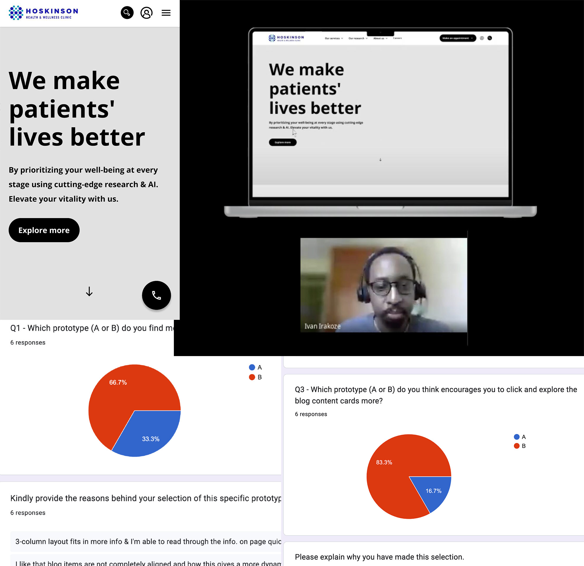
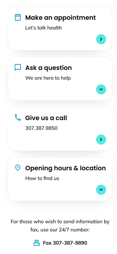
Equally vital, the new site needed to deliver an intuitive user experience for visitors while also being easy for the internal team to manage through the CMS. Empowering the client to confidently update and maintain their own content was a key objective of the redesign.

Background

Target audience

Unfortunately, it was not possible to conduct direct interviews with existing users, as the client was unable to provide access. However, through independent research and the information shared by the client, I was able to build a clearer picture of the current and potential user base, which helped inform the creation of user personas.

From the data gathered, the current audience is primarily local, but the client expressed a clear ambition to expand globally – welcoming international patients who would travel to the centre for treatment, with the option to pay for services using cryptocurrency. This forward-looking goal had to be considered throughout the design process to ensure the platform would eventually support a broader, more diverse audience.

Local Demographics (Campbell County, WY):

  • Population: Over 500,000
  • Known for national parks, valleys, and hot springs
  • One of the highest suicide rates in the United States
  • Average age: 35
  • Gender split: 51.4% male / 48.6% female
  • Ethnicity: 83% white
  • Common careers: Transportation, Food Service, Sales
  • Median household income: $67,300
    (Source: Campbell County Memorial Hospital CHNA)

Learning from the Existing Site

Before starting the UX redesign, it was important for me to thoroughly review the existing site—not just to identify what needed to be added, but to evaluate what was and wasn’t working. While the client had already outlined several new features they wanted to include, I began by analysing the current structure and content to inform the next phase of design.

The top-level navigation was too limited to support additional content. Many of the navigation labels could be consolidated for clarity, and the navigation bar itself would disappear once the user scrolled below the fold—an issue that affected both desktop and mobile experiences. It was clear that the navigation needed significant improvement.

From a content perspective, much of it lacked depth and ended abruptly, without guiding users to take further action. For example, the “Our Services” section displayed a list of offerings but didn’t link to more detailed information, missing an opportunity to engage users further. Similarly, the “Our Values” section used icons and one-word descriptors, which didn’t effectively communicate the organisation’s ethos—particularly for prospective employees trying to understand the culture.

Hoskinson He

In addition, the site featured a patient portal, which allows users to view their health records, billing history, and make payments. Patients can also send messages to their healthcare provider—such as asking medical questions, requesting prescription refills, or enquiring about billing. However, we were not given access to this portal, and the information provided was limited. Notably, users cannot book appointments via the portal; instead, appointments must still be scheduled by phone or email. This aligned with the client’s intention to encourage phone-based appointment booking, as they had recently increased staffing in their call centre to better support this approach. Their online scheduling system was known to be unreliable, and pushing users toward phone bookings was seen as a more dependable interim solution. These limitations and workarounds are important considerations for future UX improvements.

Competitors

Competitor Analysis

The next step was to analyse competitor websites, based on a list provided by the client—which proved extremely helpful. This allowed me to assess what made those sites more appealing or successful, and to identify any features or approaches that could be adapted for the new Hoskinson Health website.

Overall, I found that many competitor sites felt outdated, often featuring 1990s-style graphics and cluttered navigation structures. However, their mobile versions were generally stronger, offering quicker access to key information—most notably, prominent “Book an Appointment” links, which were missing from Hoskinson’s existing site.

Competitor sites also tended to offer more in-depth content around available treatments, giving users greater confidence and clarity. Many included dedicated pages highlighting recognised awards, accreditations, and testimonials—elements that build trust and position the provider as an established and credible service.

Extended Research

After conducting the competitor analysis, it was important to broaden the research and explore well-known websites beyond the client’s list—such as NHS, Bupa, and Cancer Research UK. The aim was to identify key design components, layout strategies, and typographic styles that could inspire a more engaging and user-friendly experience for the Hoskinson Health site.

One example was www.lyrahealth.com, which featured clear user instructions within the hero section to guide visitors towards the main objective—an event they were promoting. However, while the layout was strong, the messaging around their actual services was less clear, with key information hidden within the About page. That said, the site did present personalised treatment details effectively, using iconography to highlight relevant bite-sized information and combining bold typography with subtle illustrations to maintain visual interest.

Inspiration

Another source of inspiration was www.ki-health.com, which used a blend of animation and large-scale typography to draw users into the content in a dynamic and engaging way.

www.betterme.world also stood out for its inviting landing page, which used full-screen video above the fold to immediately capture user interest. The introduction was short and clear, supported by a strong call-to-action—“Get Started”—that made the user journey feel effortless.

Key Takeaways for UX/UI Direction

These examples helped highlight best practices in clarity, visual hierarchy, and engaging microinteractions—elements that informed design decisions in the next phase. They also showcased a number of thoughtful UX and UI features—such as clear onboarding flows, strong call-to-actions, mobile-first layouts, and the effective use of animation and iconography—that should be considered during the design exploration for the Hoskinson Health site.

Object mapping

Object mapping was conducted to help the client, myself, and the development team gain a clear understanding of what content was required, what was missing, and where further input from the client was needed. It also served as an effective tool for defining the site map, clarifying key information, and identifying any additional components or content that should be included—along with how and where they would sit within each “object” page in terms of structure and hierarchy.

The client was able to comment directly within the FigJam file, making the object map a central source of truth throughout the process. It also provided a useful opportunity to make suggestions—such as “It would be great if we could also add this…”—helping to shape each page with a more structured, narrative-driven hierarchy.

By conducting object mapping early in the process, it laid a solid foundation for the next phase of UX wireframing—ensuring that layouts were informed by clearly defined content needs, page structure, and user priorities.

Background

Low Fidelity Designs

Usability Testing

I designed and developed UX wireframes and an interactive prototype in Figma for both desktop and mobile. Before presenting it to the client, it was important for me to test the user experience and identify any features or flows that might be unclear or unintuitive.

I initially asked the client to help source patients who would be willing to participate in user testing. Unfortunately, they were unable to provide a list, so instead, I reached out to colleagues within my company who were willing to take part. I recorded these sessions so I could refer back to them during the refinement process.

To further validate and improve the experience, I conducted A/B testing to challenge smaller UX assumptions. I also created a questionnaire that allowed participants to interact with the prototype independently and provide structured feedback on usability and clarity.

Some of the key questions I included were:

  • What is your initial impression of this website/wireframe? What do you think it’s about?
  • Imagine you want to make an appointment using your email address. Can you demonstrate how you would do that on this website?
  • Can you find information about the patient portal on this website? How would you go about accessing it?

These targeted questions helped assess the clarity of navigation, the discoverability of key features, and how effectively users could complete typical tasks.

Background

High Fidelity Designs

After completing user testing and reviewing the insights, I moved into developing the high-fidelity designs. As the client expanded the number of departments and treatments, the original navigation structure no longer supported the growing content. To address this, I conducted additional UX validation and A/B testing to identify usability gaps and ensure the new information architecture remained intuitive. This led to the introduction of a more robust mega-menu system, improving navigation clarity and helping users access services more efficiently.

Final Desktop Prototype

Figma was used to design and build this prototype, making it easier for the client to visualise the experience in context. The prototype also supports user testing and helps identify and resolve UX issues early.

Final Mobile Prototype

The software Figma was used to design and create this prototype, along with Adobe After effects, Photoshop and Illustrator.

The site is now live, and the client has had full control over all aesthetics and content since 2024..