
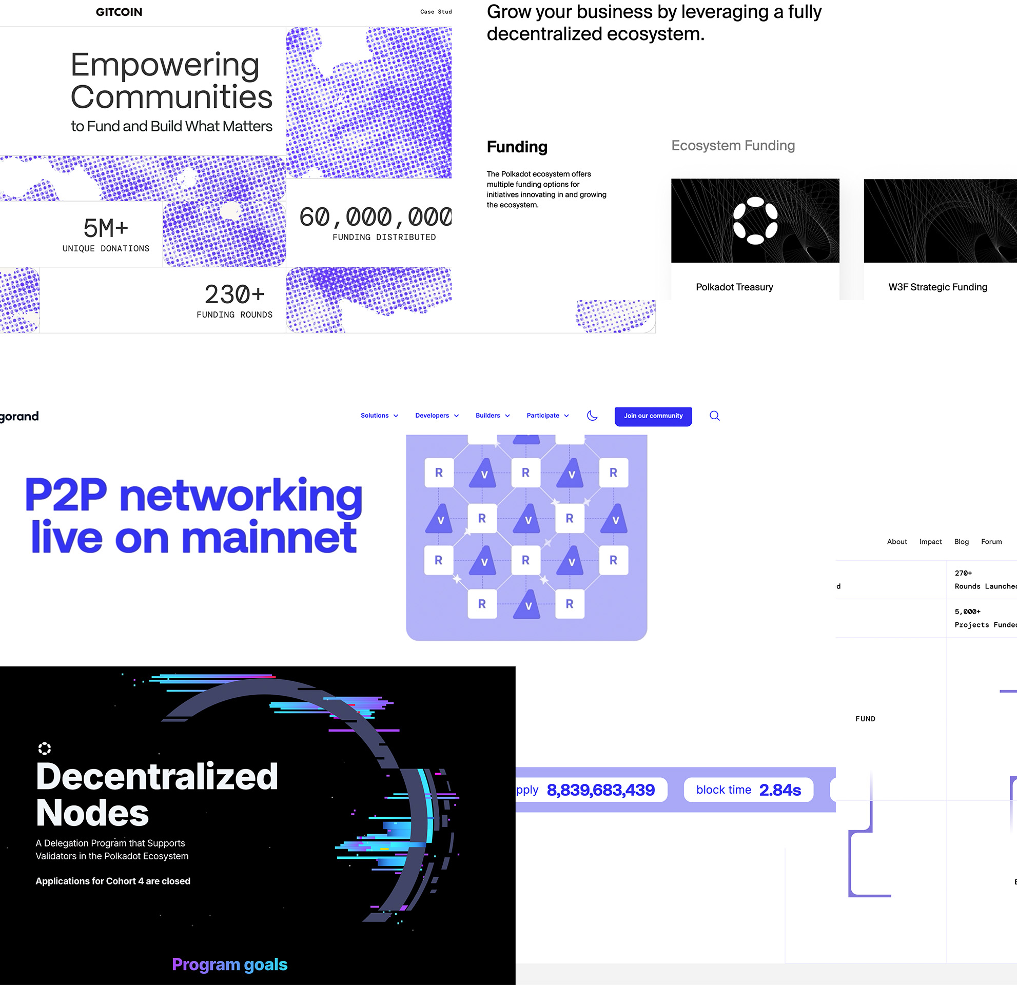

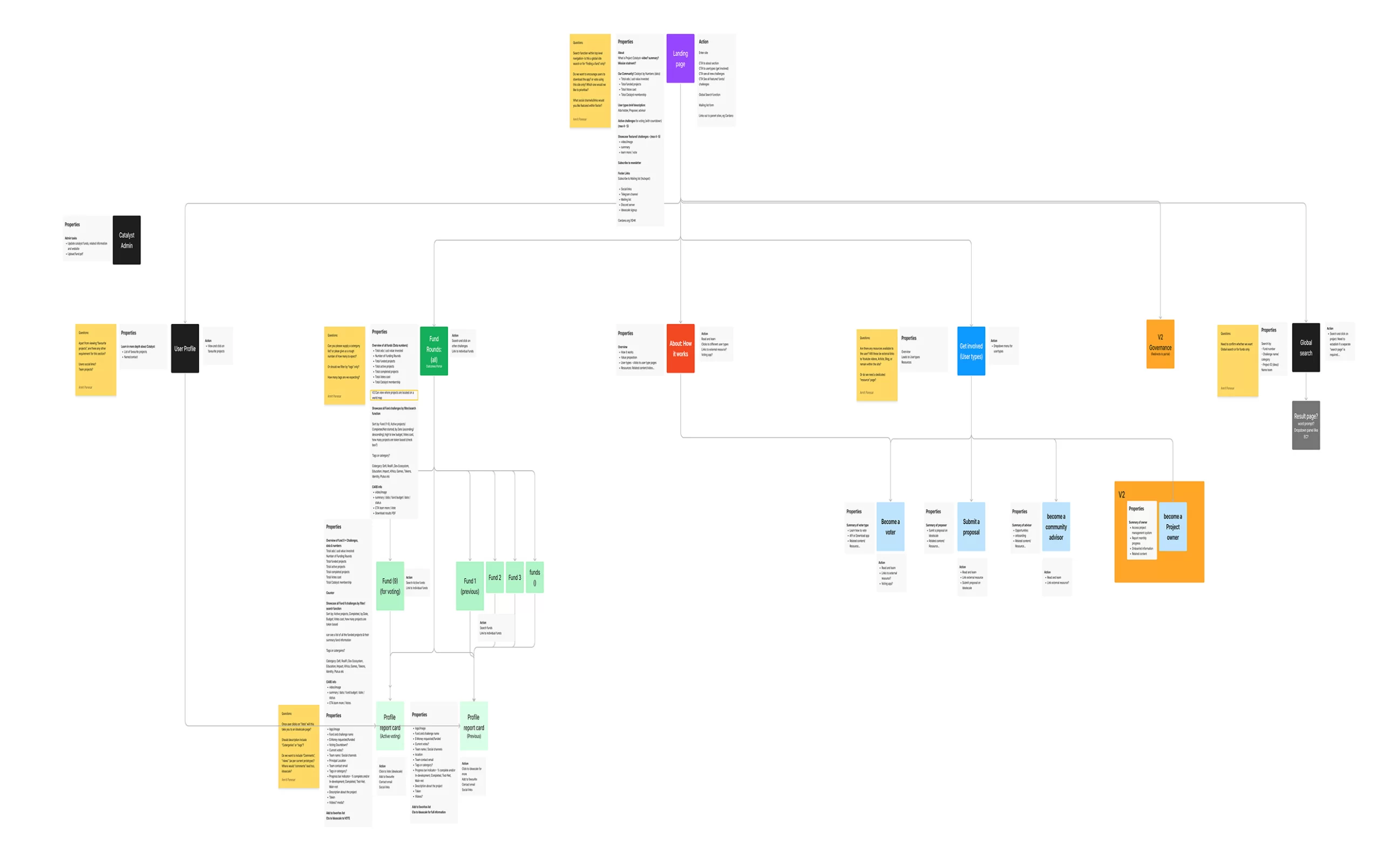
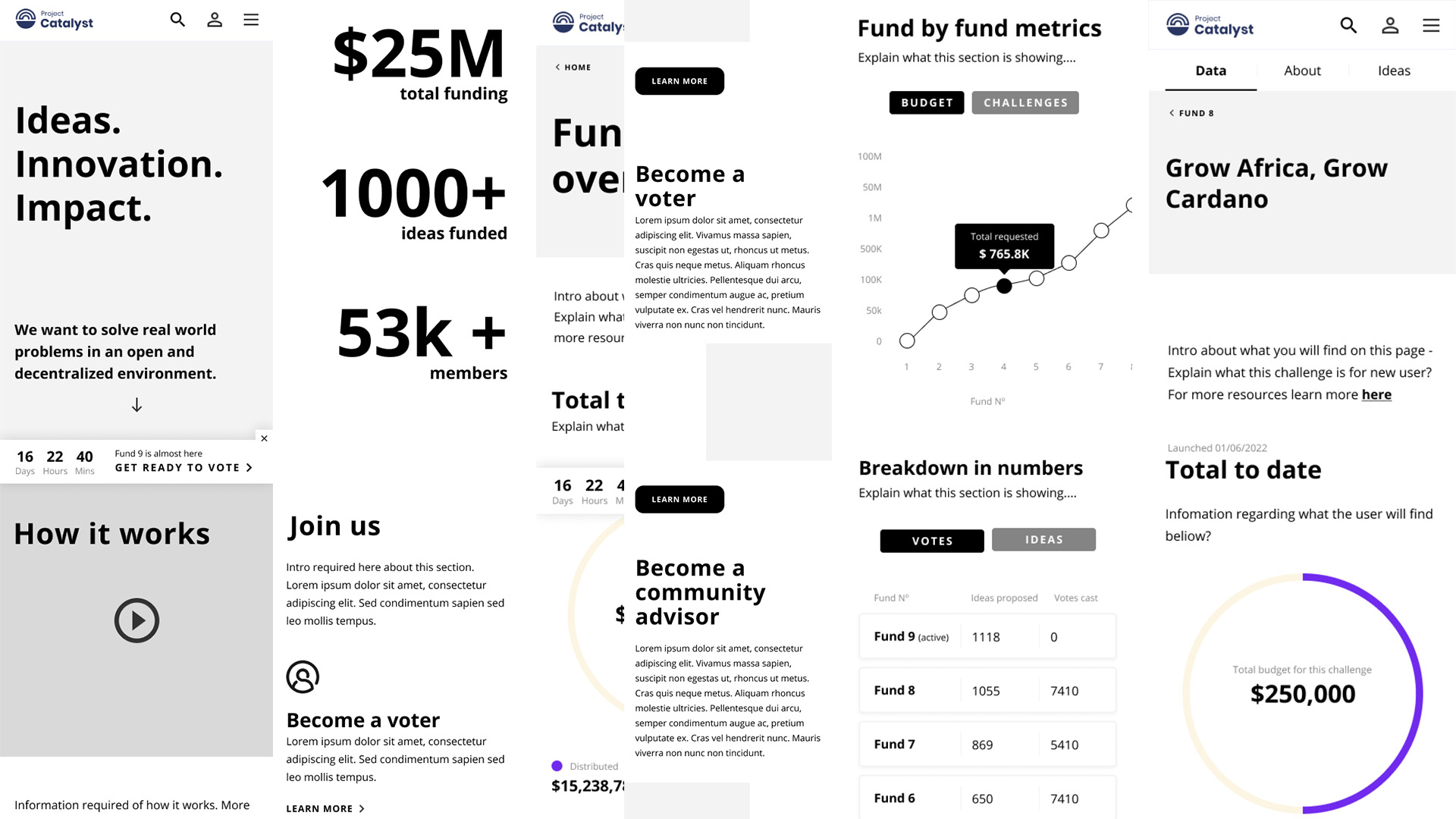
The client had already supplied a detailed Excel document containing a large set of project data. My role was to help translate this raw information into a clear and accessible experience for users across the site.
The dataset included figures and context around project details, country of origin, milestones, ADA distribution, and fund performance, to name a few. I worked closely with the client to identify which data was most important to surface and how best to display it. Together, we defined the content and structure of a user-friendly dashboard that could clearly communicate the key insights.
The final solution allowed users to interact with key statistics, explore funding outcomes, and understand the global scale of Catalyst’s impact. By turning a complex spreadsheet into a clean, visual experience, the dashboard helped make the platform more transparent, informative, and engaging.